Element reference
The standard elements of a deckle site at a glance: what each is for, its fields on the General and Appearance tabs, and a tip.
This page describes the elements a new deckle site comes with: what each one is for, which fields it has on the General and Appearance tabs, and a tip for using it. The pictures show how the elements look on the demo site used for this guide.
Text elements
Text
For running text: paragraphs, headings, lists, links and tables, with buttons and icons in between.
- General: Body, the text itself (see Rich text and links).
- Appearance: none.
- Tip: start each text with an H2 heading. Several shorter Text elements are easier to rearrange than one long one.
Hero
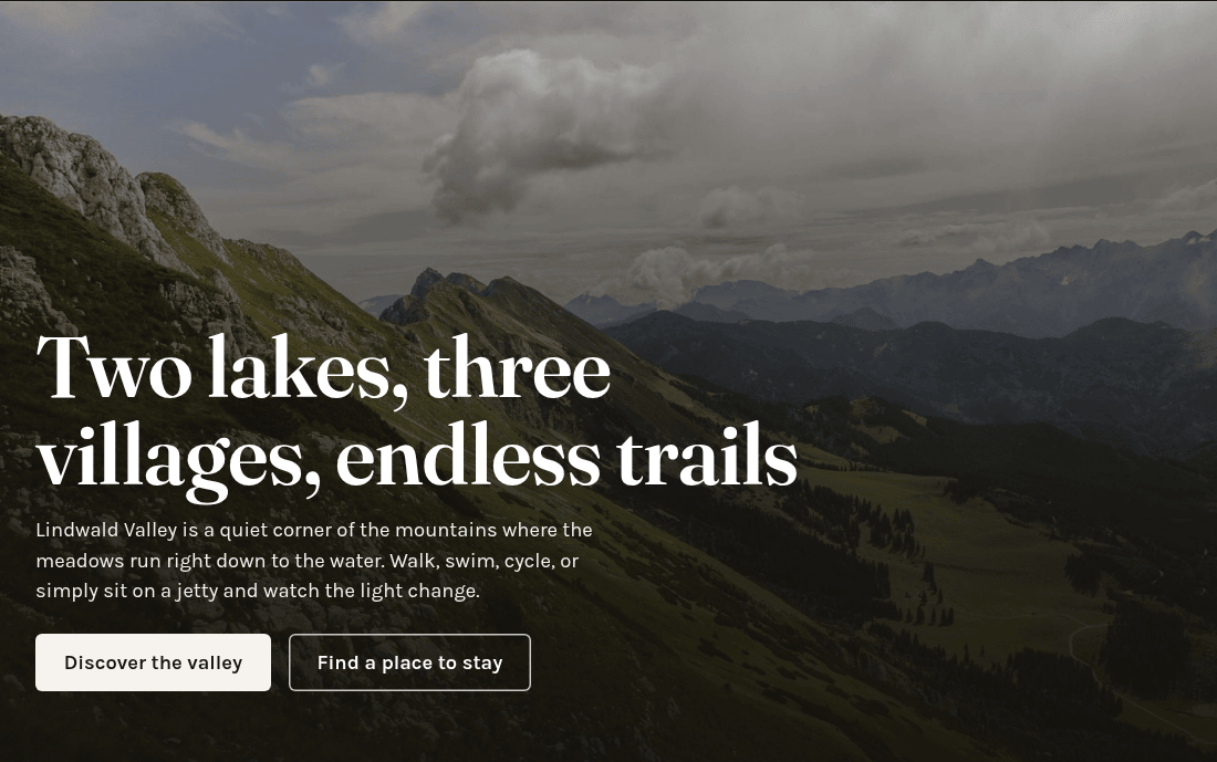
A large heading on a background photo, with an introduction and buttons, usually at the top of the home page.
- General: Heading (required), Image (the background photo, optional) and Body with bold, italic, links, lists, headings and buttons.
- Tip: the heading is a section heading, not the page title. The background photo counts as decoration, so it needs no alternative text.
Call to action
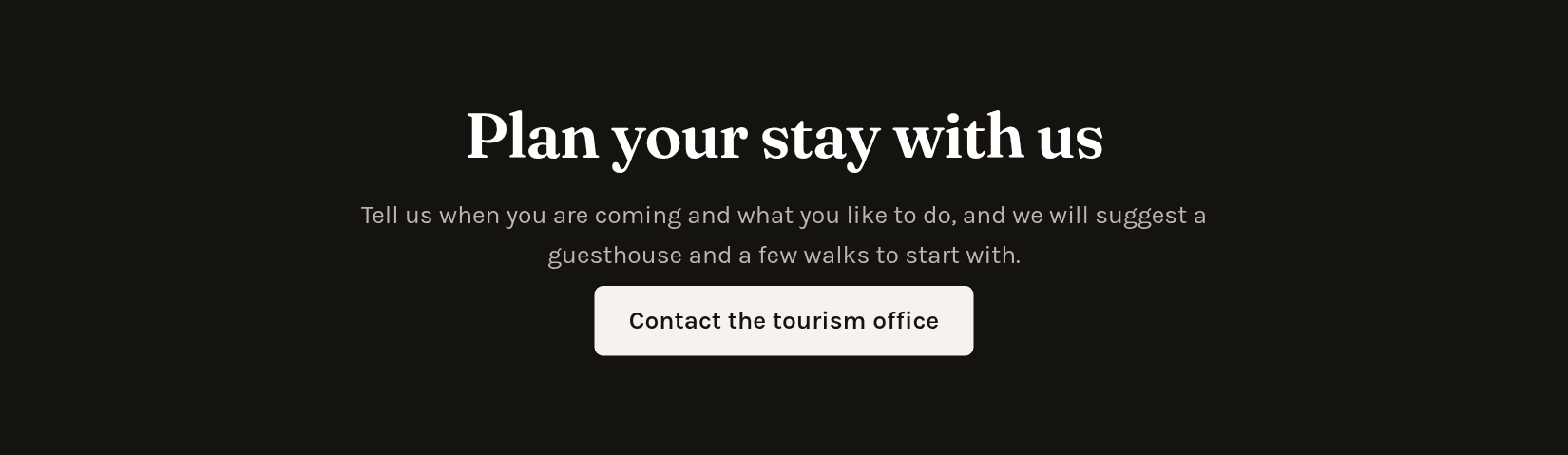
A highlighted strip that invites visitors to do something, such as get in touch or book.
- General: Heading (optional) and Body with bold, italic, links and buttons.
- Tip: keep the text short and add one or two buttons with Insert.
Quote
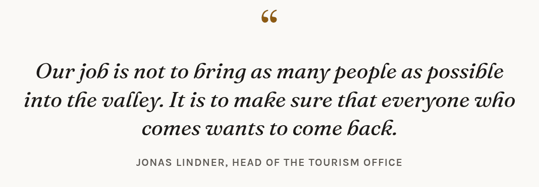
A quotation set off from the text, for example a statement by a guest or a partner.
- General: Body with bold, italic and links, and Attribution, the person quoted.
Accordion
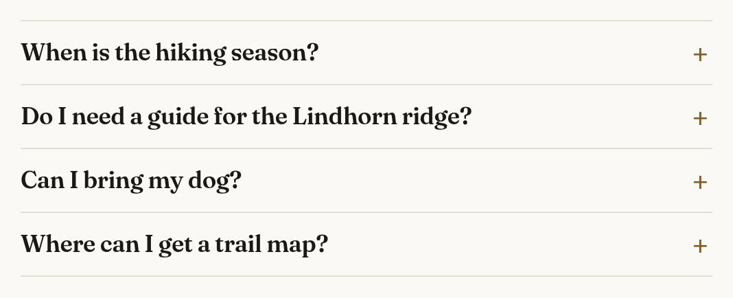
Questions and answers, or other sections that visitors open with a click.
- General: the Accordion itself has no fields. Inside it, add one Accordion item per section (see Adding an element). Each item has Summary (always visible), the question (required), and Body, the answer. The answer is a simple text box without a toolbar; an empty line starts a new paragraph.
- Tip: in the View module, clicking an item opens its form instead of opening the item.
Images and media
Text and media
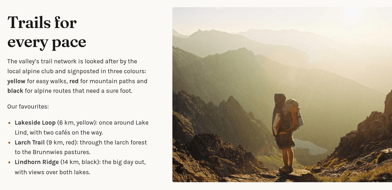
Text next to one or more pictures.
- General: Body with bold, italic, links, lists and headings, and Images, one row per picture with Image (required), Alternative text, Title, Description and Link.
- Appearance: Media side (left or right), Columns (1 to 4, for several pictures) and Open images in a lightbox (pictures enlarge when clicked).
- Tip: describe each picture under Alternative text so screen readers can read it out. Without it, the picture counts as decoration. See Choosing images.
Images
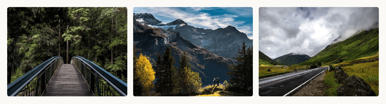
A grid of one or more pictures.
- General: Images, one row per picture, with the same fields as in Text and media.
- Appearance: Columns (1 to 4) and Open images in a lightbox. A picture with its own Link opens that link instead.
- Tip: a chosen picture cannot be swapped. To change it, remove its row and add a new one.
Video embed
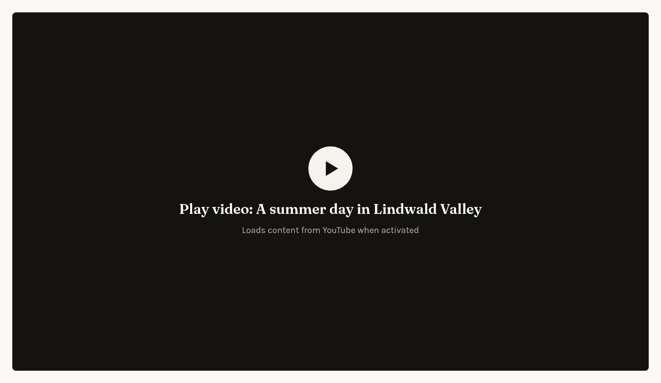
A video from YouTube or Vimeo.
- General: Provider (youtube or vimeo), Video ID (required) and Title.
- Tip: paste the video’s full address into Video ID: the editor keeps only the ID and sets the provider. Visitors first see a placeholder; the video is loaded from YouTube or Vimeo only when they click it, which protects their privacy. The form shows no video, so check it in the View module.
Lists and teasers
Cards
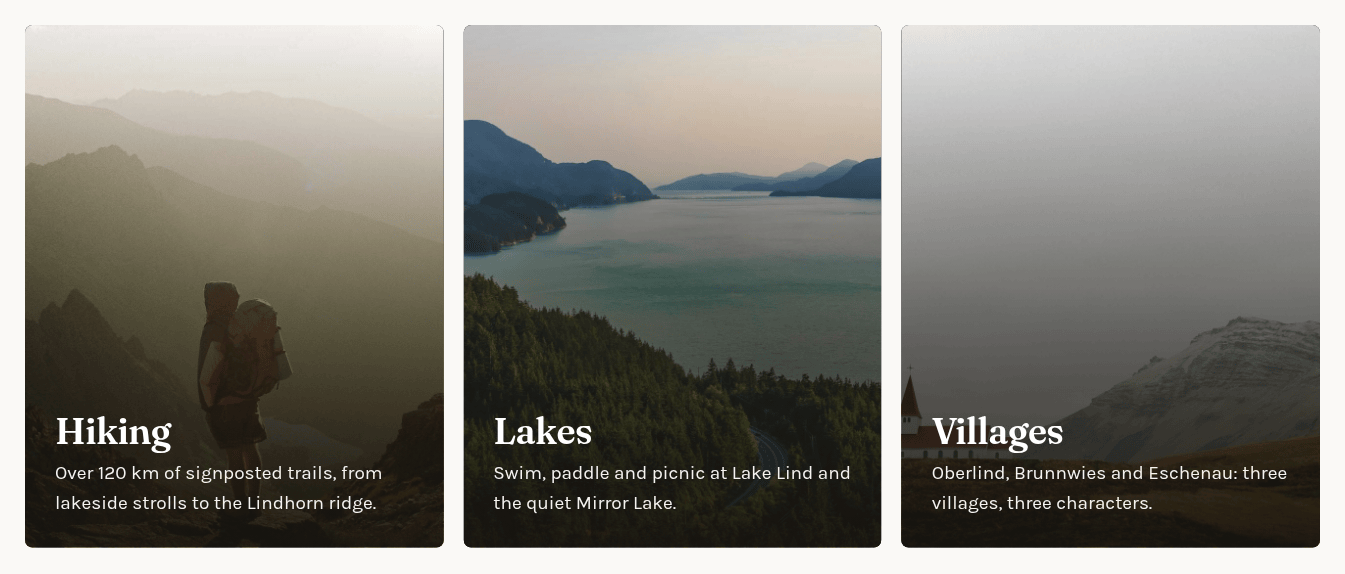
A grid of cards, each with a picture, a heading, a short text and a link, for example to point to other pages.
- General: Cards, one row per card (Add Card) with Image, Heading (required), Text and Link.
- Appearance: Columns, the number of cards per row (2, 3 or 4). On small screens fewer cards fit in a row.
- Tip: Text is a single paragraph without line breaks.
Page teasers
Lists the subpages of a page, each linking to it.
- General: Section (required), the page whose subpages are listed, chosen with Choose….
- Tip: the list updates itself. Only enabled subpages appear; disabled ones are never listed, not even in the preview.

Latest news
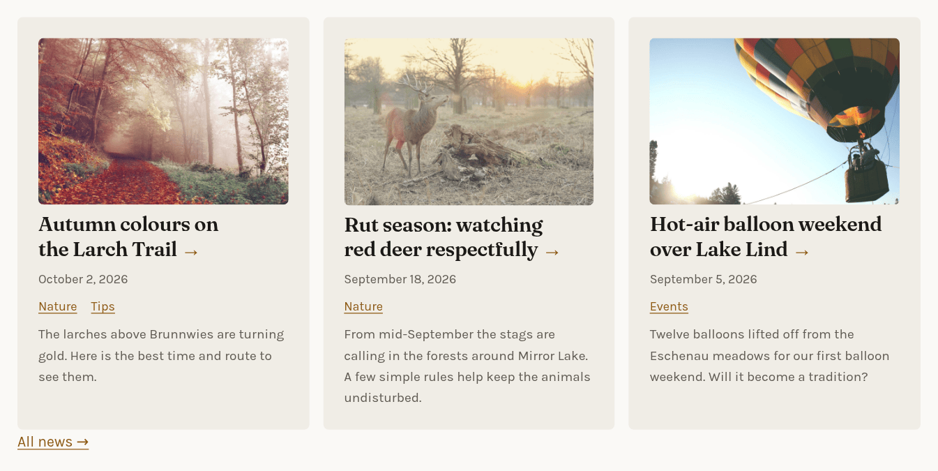
Only on sites with news: the most recent news items, newest first.
- General: News section (required; only news pages can be chosen), Number of items (5 unless you change it), Categories (only items in at least one of these; none selected means all news) and Show “All news” link (adds a link to the news page).
- Tip: only enabled news items are shown. See Managing news.
Structure
Spacer
Extra white space between two elements.
- General: no fields.
- Appearance: Size (s, m, l or xl).
Inside a text
These two elements are placed inside a text with Insert (see Rich text and links), so they are not listed in the Insert element dialog.
Button
A link that looks like a button.
- Fields: Link target (required), Label (required) and Variant (primary or secondary, the two button styles of your site).
Icon
A small symbol in the text, for example in front of an address or opening hours.
- Fields: Icon name (required), chosen from a list such as arrow-right, mail, phone, download, calendar, location or clock.
- Tip: icons are decoration and screen readers skip them, so always write the information itself as text next to the icon.
Raw HTML
Pages may contain an element called Raw HTML (developer only), added by the person who looks after your website. It cannot be inserted from the dialog. Leave changes to it to them.