Editing an element
Open the form of an element, change its fields on the General, Appearance and Access tabs, fix error messages and switch an element off.
Every element has a form with its texts, images, links and options. This page shows how to open the form, what its buttons and tabs do, how the different fields work and how to take an element off the website without deleting it.
Open the form
- On the page’s Content tab, click the element’s card, its pencil, or ⋮ and Edit.
- In the View module, click the element in the preview (see Preview).
- A new element’s form opens by itself right after you insert it.
The toolbar
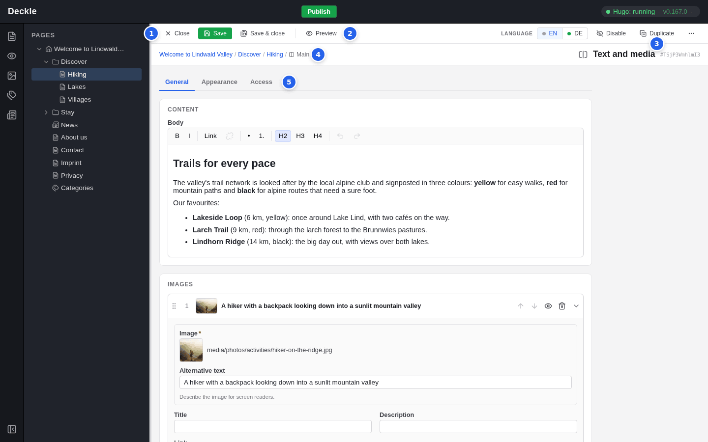
- Close leaves the form. Save saves and stays. Save & close saves and takes you back to the page or preview you came from.
- Preview shows the element on the page in the View module, outlined in blue. The preview shows saved content only.
- Disable or Enable hides or shows the element when you save. Duplicate puts a copy right after it. ⋯ offers Cut, Copy, Move up, Move down and Delete….
- The breadcrumbs show the page and the area the element is in, here Main.
- The tabs General, Appearance and Access.
While you have changes that are not saved yet, Unsaved changes appears next to the element’s name.
General, Appearance and Access
- General holds the content: texts, images, links and rows such as the pictures of an image grid.
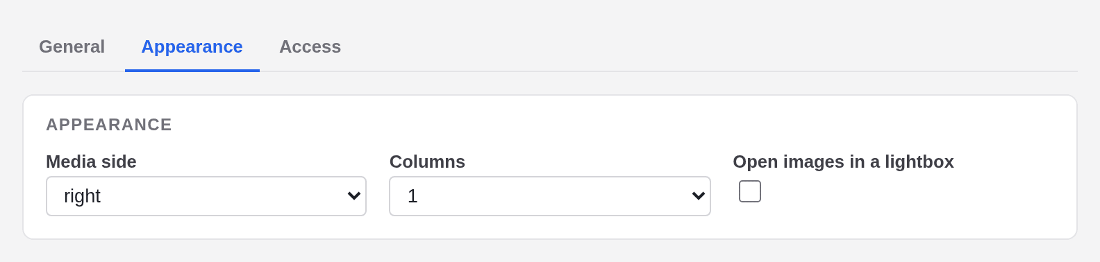
- Appearance holds options for the look, for example the side of the picture or the number of columns.
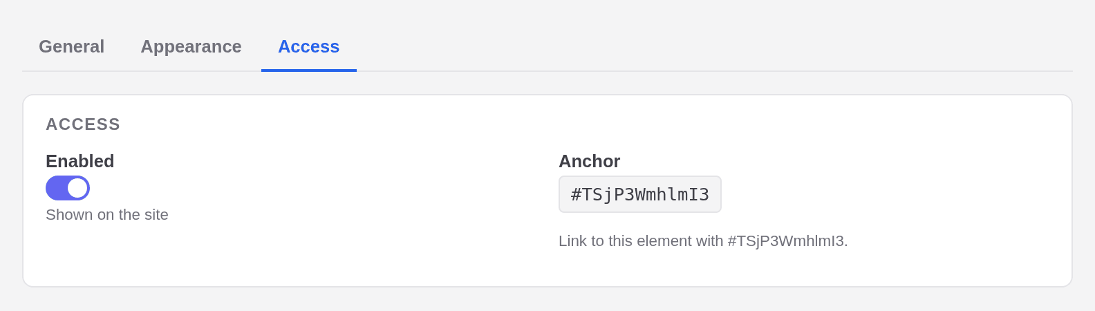
- Access holds the Enabled switch and the element’s Anchor (see below).
Your entries stay when you switch tabs, and one Save saves all three. A red dot on a tab means that a field on it has a problem. On a site with several languages, Appearance options are the same in every language, while General content is translated (see Translating pages and elements).
The fields
| Field | What it looks like | Good to know |
|---|---|---|
| Text | a one-line box | For short texts such as a heading. |
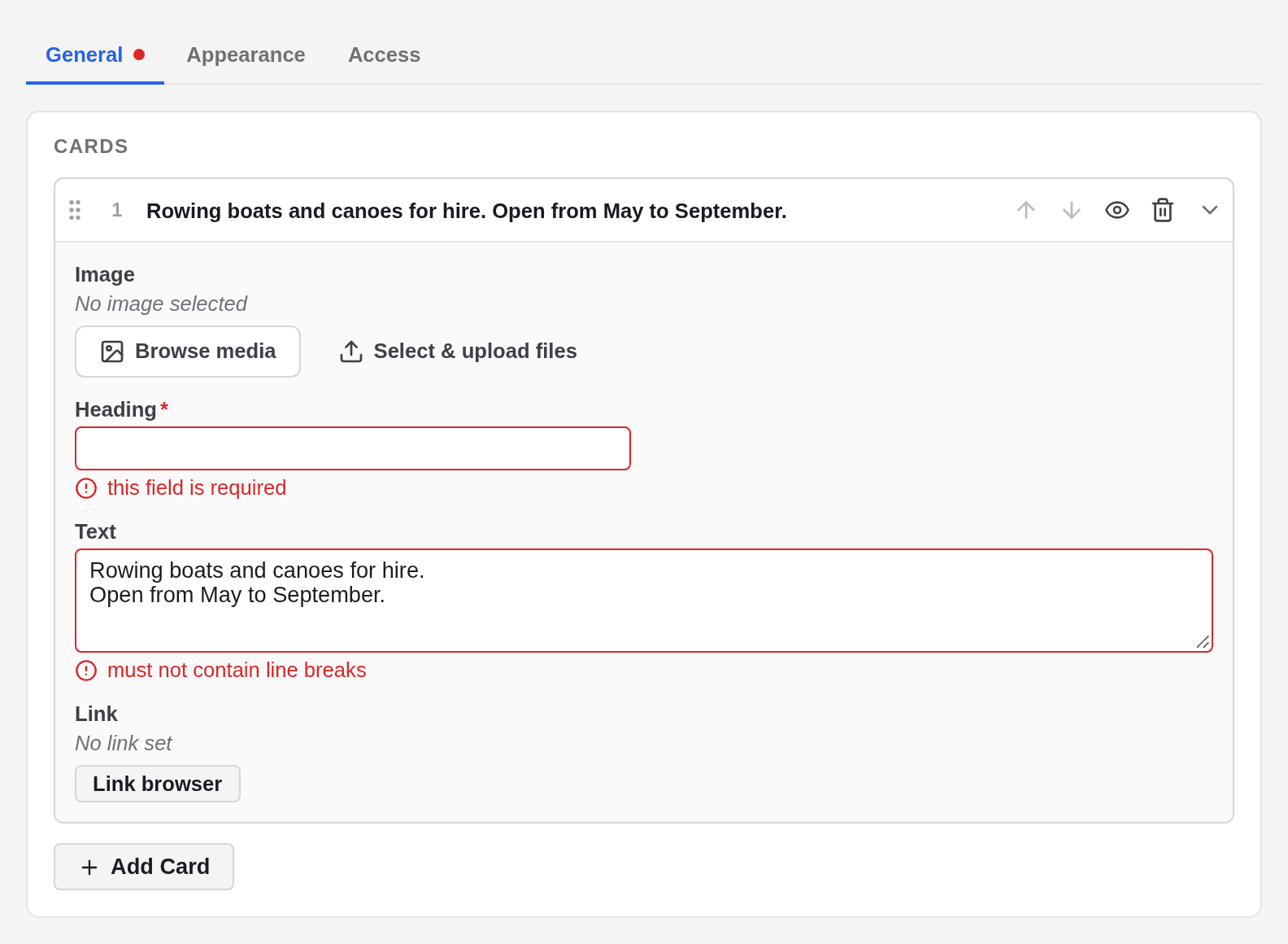
| Multi-line text | a larger box | No line breaks: an Enter leads to “must not contain line breaks”. |
| Body | a text editor with a toolbar | Paragraphs, headings, lists and links, see Rich text and links. |
| Yes or no | a checkbox | Tick it to switch the option on. |
| Choice | a dropdown | Shows the options as stored, for example left, 3 or primary. |
| Number | a number box | Only digits, otherwise “must be a number”. |
| Date and time | the browser’s date picker | In your local time. |
| Image | Browse media, Select & upload files | Then Replace… and Clear. See Choosing images. |
| Link | Link browser | Then Edit… and Clear. See Rich text and links. |
| Page | Choose… | Picks a page of your site, for example a section. |
| Categories | one button per category | Click the ones that apply; see Categories. |
Required fields and error messages
A red star marks a required field. The editor checks a field when you leave it and when you save. A problem appears in red under the field, the tab gets a red dot, and the form is not saved until you fix it. A newly inserted element shows “this field is required” on its empty required fields right away; that is normal.
Rows: images, cards and other items
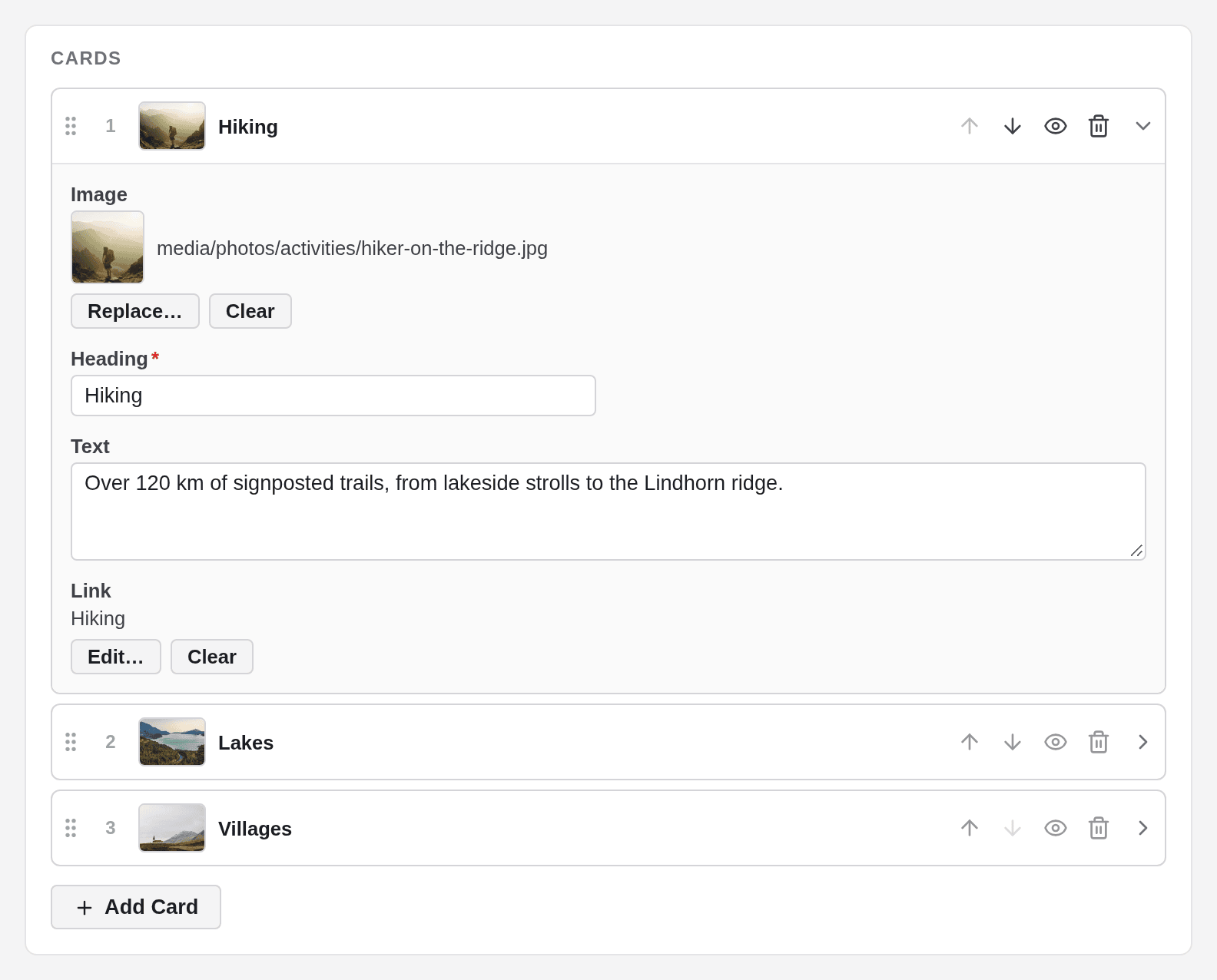
Some elements hold a list of rows, for example the pictures of an Images element or the cards of a Cards element.
- Add a row with the button under the list, for example Add Card. For pictures, Browse media adds several files at once, one row each.
- Open or close a row by clicking its header.
- Change the order with the arrows (Move up, Move down) or by dragging a row by its grip.
- Hide a row on the website with its eye (Disable item).
- Remove a row with the bin (Remove item). The editor does not ask first.
In an image row, the picture cannot be swapped: remove the row and add a new one. Row changes take effect when you save; until then, Close and Discard changes throw them away.
Save, or leave without saving
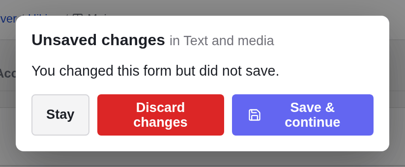
Ctrl+S (Cmd+S on a Mac) saves, even while you type in a field; Escape closes the form. If you leave a form with unsaved changes, for example by clicking another page, the editor asks first: Stay, Discard changes or Save & continue.
Take an element off the website
To hide an element without deleting it, disable it. It stays on the page in the editor, faded and marked Disabled, but is not shown on the website or in the preview.
- The eye on the card, or ⋮ and Disable, take effect immediately.
- Disable in the form’s toolbar, or the Enabled switch on the Access tab, take effect when you save.
Enable switches it back on. Disabling an element that holds others, such as an Accordion, hides everything inside it too.

The anchor
The Access tab also shows the element’s Anchor, a short code starting with #. It lets a link jump straight to this element on the page. The anchor stays the same in every language.